Really Nice Chemdraws
I really enjoy the figures that the Nicewicz lab produces for their publications. Scrolling through this page, it's clear that there's a distinct style there that I don't see in other research groups. And you don't see them in the MacMillian or Johnson group publications, so he didn't pick it up from a former PI.
If you scroll down far enough, you can see that most of it is there from the beginning. But the font took a while to show up (the 2015 JACS paper at 18 doesn't have it, but the Science paper at 19 does). There's a transition period for the font, then it's really consistent onward.
There's probably some subtle factors that I'm not seeing, but to my eye, there are a few things that make the Nicewicz lab figures stand out:
- the font face and relative thinness compared to the bonds
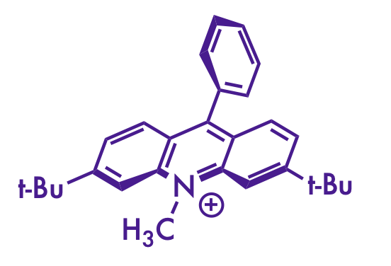
- liberal use of stereochemical wedges and dashes (especially on the acridinium catalysts)
- a consistent use of specific red and blue colors for emphasis
I think I have some ChemDraw settings that more-or-less replicate the Nicewicz style as much as I can manage. The version of the table of contents graphic for this paper on the Nicewicz website includes some color swatches that the one on the Synlett site doesn't, and that helped a lot to nail down the colors.
- Futura Medium, size 10
- 0.016 inch line width
- 0.032 inch bold width
- 0.2 inch fixed bond length
- Red color: 186, 6, 6 rgb (#BA0606 hex)
- Dark blue: 55, 6, 123 rgb (#37067B hex)
- Light blue: 118, 146, 183 rgb (#7692B7 hex)

(my attempt at a Nicewicz-style drawing)
Although I still can't figure out how to get the acridinium catalyst to look right. Bolding the correct bonds and wrangling it into the right orientation with the Structure Perspective tool in ChemDraw gets it close, but the double bonds get a little squished on some of them. And I still think the font isn't quite right. Maybe there's a Futura Light that they use that I don't have installed.
In any case, I wish I could make figures that look as good as Nicewicz's without obviously copying the style. Mine aren't too bad, I guess. At least I'm not [putting] [every] [word] [in] [brackets].