A Necessary Addition to the Style Guide
Drawings of chemical structures are one of the most important ways (especially organic) chemists convey information. And while everyone has their style, there are certain conventions that are universal.
And while I think that nitpicking Chemdraws in presentations is not always constructive, when it comes to publishing, I think there is usefulness in having a style guide. At the very least, drawn structures that are consistent within a paper make taking in the information frictionless. Consistency within a single figure, I think, is even more important. Take this reaction that I ran a bunch of times in graduate school:
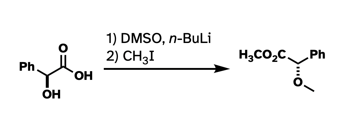
This drawing isn't technically wrong. But I've rotated the whole thing around. I've drawn methyl groups two different ways. I also abbreviated the carboxylate in the product but not in the starting material. It would be a lot more clear what's going on if I had "locked in" as much of the structure as possible so the most obvious things to stick out were the changes, and if the abbreviations were consistent.
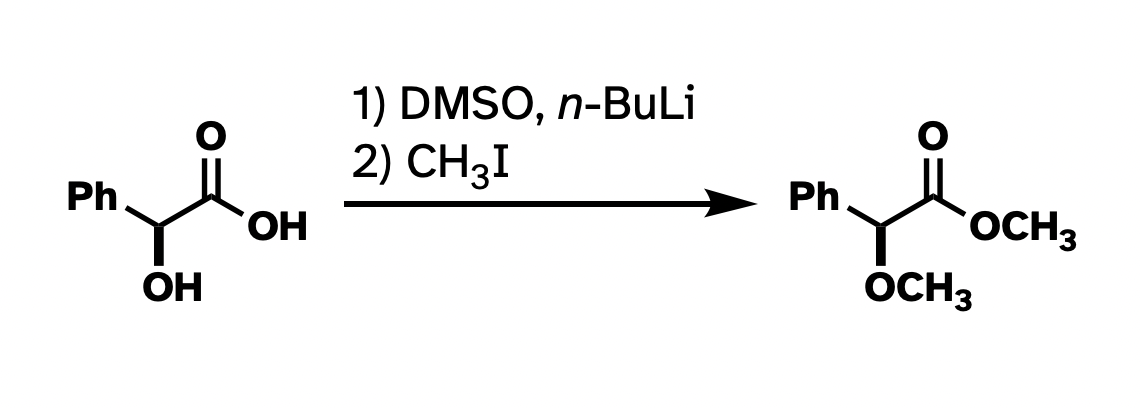
Better, right?
This argument has little to do with the asthetics of the above structures. For instance, I really don't like "hanging stick" methyls, like on the ether in the first drawing. But many use it, and it's not really wrong. The actual problem here is clarity and consistency. There wasn't a reagent that looks like "–– I" in the starting materials, so why put it in the product? And there's one "H3C" in the product that works all right, so why not be consistent with the methyls? The point of these drawings is for the easy conveyance of information. I think the top drawing does not do a very good job at that.
This brings me to a paper that dropped in OPRD today. It's a good paper, with great chemistry, and I'm not even going to link to it because this criticism isn't for the authors – it's for everyone that draws structures and puts them on (virtual) paper. But look at this little slice of the header graphic:
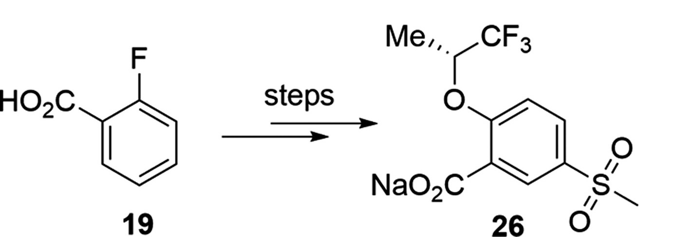
If I were to re-draw this, I'd rotate the starting material 60° counterclockwise to show that the starting carboxylic acid hasn't changed (besides being made into a sodium salt). That change makes it immediately clear what's happening here – an SNAr followed by some sort of electrophilic sulfonation reaction. Also, they've abbreviated a methyl two different ways – as "Me" and as a hanging stick. Not so bad, really, but it feels like two different teams worked on both halves of this molecule.
Again, this isn't an argument about what looks nice. We can argue about what looks nice, and nice looking Chemdraws look different to different people. This is about clarity and ease of information transfer. Keep as much about your starting materials and products unchanged as is practical, and let the changes stand out.